There’s a certain range of baseball watchers who might think that most of the analytics juice has been squeezed out of the game. I don’t think that many people feel the game is solved, so much as smoothed out the inefficiencies in team decision making and made the game more monotonous in the process.
One of the ways we might think about that is the convergence of metrics towards similar structures. As we learn more about the game and have more standardization in the data available, it stands to reason that different organizations would come up with more similar metrics over time.
For years our Defensive Runs Saved (DRS) metric has ruled the roost in terms of industry-leading public defensive metrics. Nothing else in the public sphere captures the breadth of defensive plays that we do: basic playmaking, double-play turning, stolen base deterrence, misplay tracking, all kinds of things.
Then the MLB team started working on Outs Above Average, leveraging the Statcast tracking data to more accurately capture some of the nuances of defensive play. That metric started with catching balls in the outfield, then spread to infield plays, and now includes some more peripheral aspects of defense like throwing, pitch framing, double plays, and stolen bases. Where there used to be a large gap conceptually, the differences are now more marginal. MLB also added a run-value-based metric, Fielding Run Value (FRV) that puts both metrics on the same scale.
There are still components of DRS that are not captured within FRV’s framework, like our Good Fielding Play / Defensive Misplay system and deterring stolen base attempts.
One big deviation that remains is that Statcast’s metrics do not set the “average” by position in the same way. Outfielders are thrown into one big pool, while infielders are compared to players with similar fielding alignment. As a result, center fielders tend to have higher FRVs than corner outfielders. In DRS, each position is centered separately, so our run values for a left fielder will be higher on average because they’re being compared to just their own position as opposed to all outfielders.
Our work has also brought the two metrics closer together. In 2020 we introduced the PART System (Positioning, Airballs, Range, Throwing) that split out responsibility for different components of the play, and perhaps most relevant removed positioning from consideration for infielders. In 2021 we did the same for outfielders. These were built-in considerations for MLB’s metric, and for years now both have been consistent in this regard.
So, are our evaluations of players also converging over time?
Well, on an individual basis it sometimes seems like they’re not on the same planet, and this is not a new phenomenon.
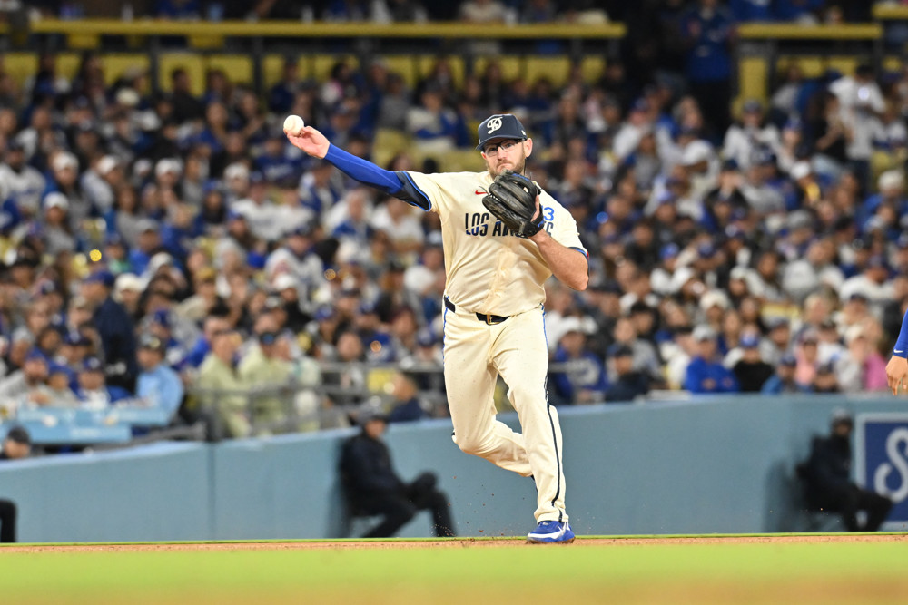
In Matt Chapman’s first full (Gold-Glove-winning) season, DRS had him with 22 Runs Saved while FRV had him with 6.
Some of this is just a difference in scale, as Chapman still ranked as a top 5 defender by FRV. And at that time the existence of the full shift (which the stats treated differently) and a greater disparity in features in the two models means the comparison wasn’t as apples-to-apples as it would be now.
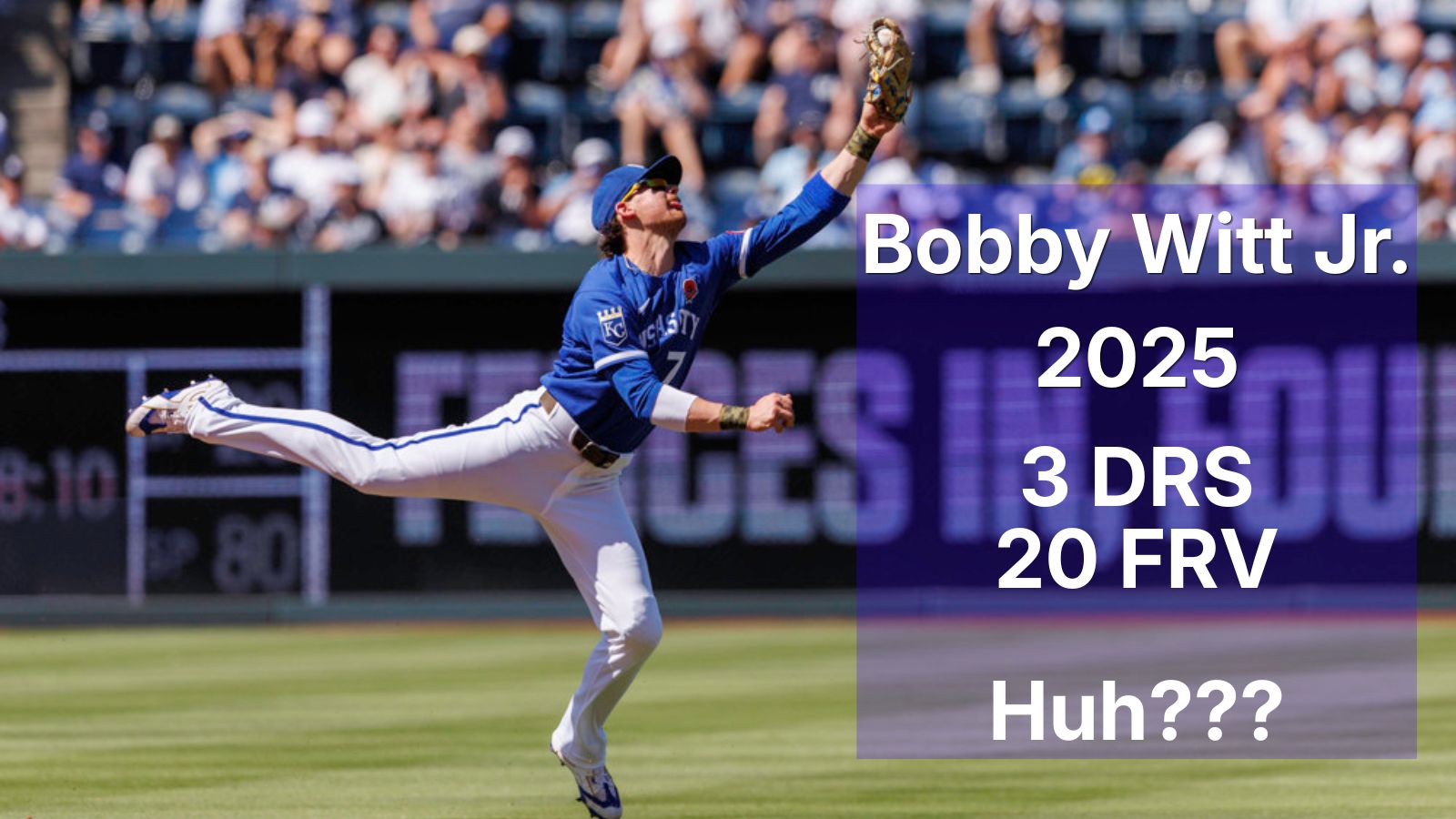
But in 2025, was Bobby Witt Jr. average (3 DRS) or elite (20 FRV)? These questions still remain, even as the gap between the calculations shrinks.
I took a look at this in aggregate from a couple different perspectives.
I compared the DRS and FRV of players at a given position for a given component of the metric.
The components were:
- Double plays (middle infielders only)
- Throwing (infielders and outfielders)
- Pitch framing (catchers only)
- Range (all but pitcher and catcher)
- Total (all but pitcher)
The collection of players was anyone with at least 100 innings at a position from 2018 to 2025.
I ended up with 25 combinations of position and component (like “center field arm” or “third base total”) that had at least 30 qualifying players.
The two metrics I compared were the difference between the values in the two systems (as measured by root mean squared error, or RMSE) and the correlation between the values. The reason to do both is that the metrics might move in the same direction (strong correlation) without being close in actual value (weak RMSE). Using correlation also bypasses the issue mentioned earlier of the scale being different by position.
As an example, here are two categories that show convergence over time but not an improved correlation: the throwing of middle infielders. Remember that RMSE goes down as values converge, and correlation goes up the more directionally consistent the values are.
Second Base Throwing Runs Comparison
| Season | RMSE | Correlation |
| 2018 | 3.2 | 0.04 |
| 2019 | 2.8 | 0.16 |
| 2021 | 2.5 | -0.05 |
| 2022 | 2.7 | -0.16 |
| 2023 | 2.2 | -0.07 |
| 2024 | 2.1 | -0.04 |
| 2025 | 1.9 | -0.10 |
Shortstop Throwing Runs Comparison
| Season | RMSE | Correlation |
| 2018 | 4.0 | 0.41 |
| 2019 | 4.5 | 0.21 |
| 2021 | 4.2 | 0.15 |
| 2022 | 3.6 | 0.19 |
| 2023 | 4.2 | -0.06 |
| 2024 | 3.9 | 0.17 |
| 2025 | 3.8 | 0.18 |
Across all of the position/component groups, there isn’t a trend that slaps you in the face. If I use these metrics’ slope over time to judge, I can compare the slopes of both metrics to see if there is (ahem) converging evidence for the metrics converging.
RMSE and Correlation Agreement
| Converging, per Correlation | Diverging, per Correlation | |
| Converging, per RMSE | 10 | 4 |
| Diverging, per RMSE | 3 | 8 |
While there are more metrics double-converging than double-diverging, the evidence is not particularly strong.
However, what we do see is that the total runs saved is more consistent, likely because of the movement towards a similar complete package of evaluation as FRV has added components and DRS has separated out positioning.
Of the 8 non-pitcher positions, 5 of them are converging by both metrics. Put differently, 63% of the “total” categories are double-converging, while just 29% of the individual components are.
So we basically find that specific components are not showing any particular trend, all while the overall evaluations are converging. That could sound logically inconsistent, but I don’t think it is.
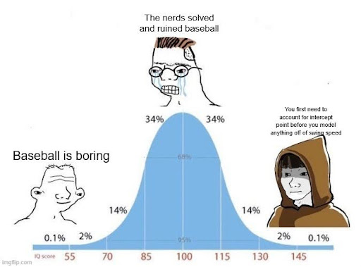
As the models grow more similar in the aspects of defense they include, our evaluations of player defense as a whole naturally become more similar. There are differences in approach within the individual components that can suggest different mechanisms by which a player is good, bad, or average, but the macro-level inclusion of more aspects of defense carries more weight than those details. And with the inclusion of these granular components we have more opportunity to investigate the differences between players, getting us closer to the right tail of the distribution above.
There will still be disagreements based on how one model calculates the value of a strong outfield arm or double-play defense, or discrepancies in what is captured within defense or not (e.g. ABS challenges), but our overall assessment of “is this guy good?” is getting more consistent with time.